nenä (means or translates from the Finnish word, nose) is a fragrance brand located in Singapore. The perception of scent is expressed into the brand identity’s including type, patterns, label design and box packaging.
Built upon nature and its elements, nenä is deeply rooted and heavily inspired by Scandinavian design. A movement influencing the visual identity whereby simplicity, minimalism and functionality are extracted. The brand offers a unique selection of curated fragrances and essential oils within the compounds and comforts of modern interiors, furnitures, homes and everyday living.
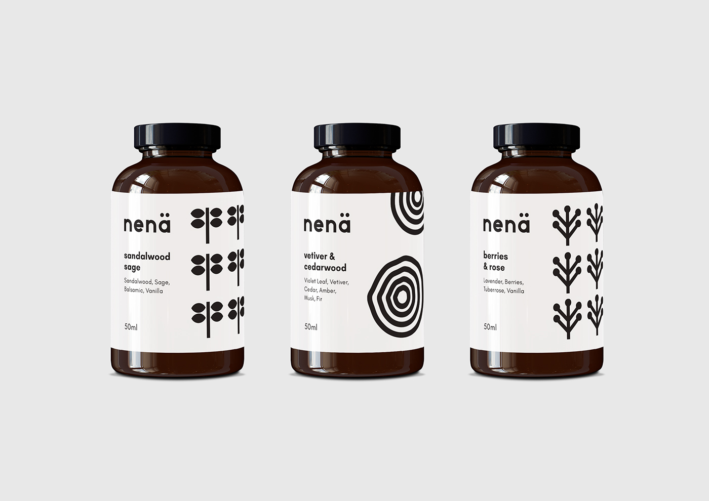
The logotype is a customised typeface designed in lowercase with a bold san-serif weight to establish a strong, bold and sturdy profile. Immediate emphasis is on the ä, representing a vowel sound and also the external round openings of the nose. The brand symbol applies a similar principle by using abstract shapes and silhouettes with a distinctive graphical look of the double dome “n’s” forms the basis of nenä — a representation of the human nose or nostrils expressed into geometric forms.
Shape and pattern play conveys the different attributes and characteristics of each scent. As the nenä oils and fragrances are formulated from ingredients, the sense of smell is perceptible and distinguishable by our noses to aromas. These forms accentuate the visual language of nenä with a repeated unifying effect. The graphical lined symbols are the main 4 essential oil ranges of: Single Note, Wood, Family and Home; giving the brand a continuity into its minimal concept. Colour scheme was kept in black and white to communicate the purity of permeable scents.